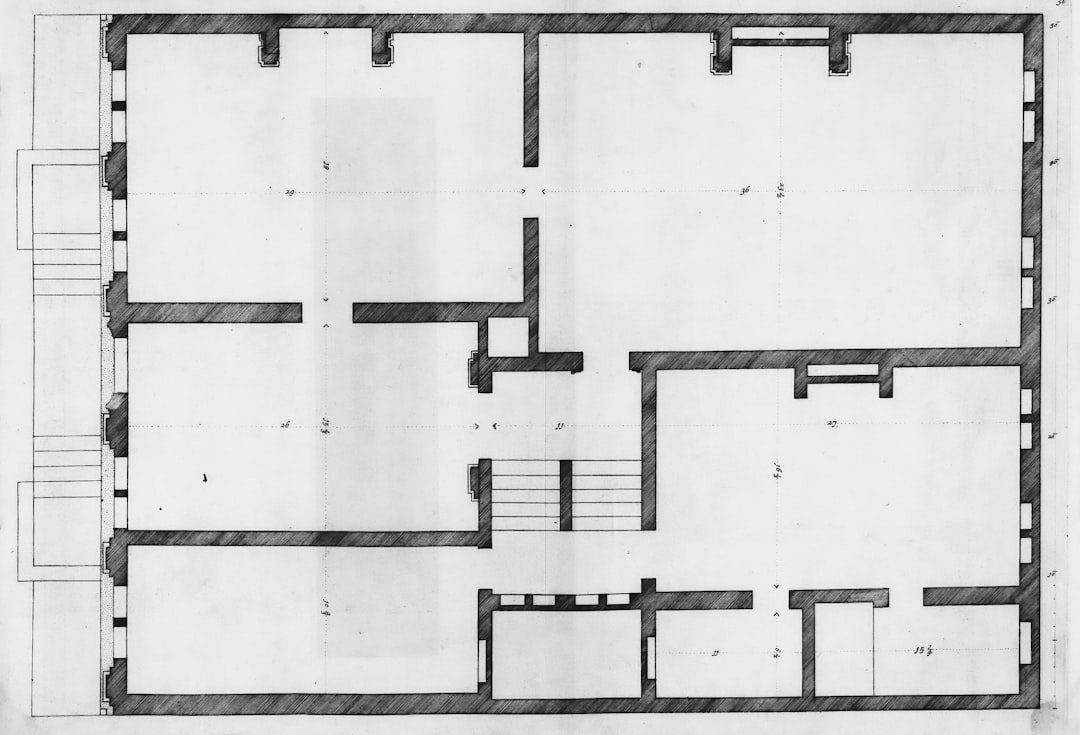
Narrow layouts get blamed for a lot. Rooms feel like hallways, furniture floats at odd angles, natural light dies somewhere between the front window and the back wall. But after working through a handful of these reworks with a tape measure and a floor plan app in hand, what we keep finding is the same thing: the constraint isn’t the width. It’s every decision that was made while ignoring the width.
This walkthrough follows a real rework of a long, narrow interior — a pre-war apartment roughly 11 feet wide and 38 feet deep — and the specific spatial moves that turned it from a corridor you slept in into a place that read as a series of connected rooms.
The Baseline Problem: What Narrow Actually Means in Spatial Terms
Before any redesign discussion starts, get precise numbers down. Not approximate, not paced-off guesses — actual dimensions measured from wall to wall at multiple points, because older buildings shift. In this case, the room widths ranged from 10’8” to 11’2” depending on where the tape landed, which matters when you’re deciding whether a sofa can float or has to push against a wall.
The original layout had four distinct zones collapsed into three rooms: entry/pass-through, main living, sleeping, and a kitchen that branched off a single corridor. The entry held nothing. The main living room had furniture arranged as if the space were square — a centered sofa, a coffee table perpendicular to a TV, two chairs facing each other — which ate every inch of clearance and left a 22-inch walk path down one side. Ergonomically, that’s below the 36-inch minimum generally recommended for primary circulation, and subjectively it felt like squeezing past your own couch.
That’s the diagnosis. Not “it’s narrow.” It’s that the furniture arrangement was fighting the geometry instead of working with it.
Move One: Establish the Spine, Then Zone Off It
The rework started with a concept borrowed from shotgun-house logic: if you have a long, narrow plan, the primary circulation path is your spine. How the shotgun home went from an affordable Southern staple to a design object is worth reading here — those layouts survived for decades precisely because their designers accepted the geometry and organized everything around a single clear axis.
In this apartment, that meant establishing a 42-inch-wide center path from front door to back wall and refusing to let anything cross it permanently. Furniture, rugs, lighting — all of it organized to one side or the other, with zones defined laterally rather than broken up with cross-traffic.
The sofa moved from centered to flush along the long wall, oriented parallel to the spine rather than perpendicular. That single change recovered 14 inches of walk clearance on the open side and, visually, stopped the room from reading as a blockage.
Move Two: Use Threshold Cues, Not Walls, to Define Zones
No walls were moved. Budget for a soft rework like this rarely includes structural work, and honestly, it rarely needs to. What defines zones in a narrow plan isn’t partition walls — it’s level changes, material shifts, and lighting.
A wool flatweave rug (approximately 5×8 feet) anchored the seating area. The kitchen zone transitioned with a strip of different flooring — in this case, existing tile that had been covered with a vinyl runner, which was removed rather than added to. The entry got a coat-hook rail at 66 inches off the floor, a narrow bench at 18 inches deep rather than the 24-inch unit that had been there, and nothing else. Clearing the entry of furniture that tried too hard made it feel deliberate instead of stuffed.
Light is doing the real zone-defining work, though. Each functional area got its own dedicated source — not relying on a single overhead fixture to cover the whole run. A swing-arm wall lamp over the reading chair, under-cabinet strips in the kitchen, and a pendant dropped to 60 inches over the dining spot. Clip-on lights deserve a mention here: in a rental or a rework where you’re not cutting into walls, a clip-on reading light on the sofa end frees you from overhead-only illumination without running new wiring.
Move Three: Address the Visual Compression at the Far End
Long narrow rooms compress visually at the far end — the back wall looks closer than it is, and anything dark or heavy placed there accelerates that effect. The designer’s move here was specific: the back wall got painted two values lighter than the side walls (a warm off-white against the existing pale gray), and a vertical element — a floor-to-ceiling bookshelf, 14 inches deep — was placed there instead of against a side wall.
Counterintuitive, but it works. Vertical lines draw the eye up rather than toward the wall, and a bookshelf filled with varied-depth objects creates enough visual complexity that your brain stops measuring the distance to it.
The side walls, meanwhile, got horizontal elements kept low: a credenza at 28 inches, art hung at 54 inches to center (not stacked high), and window treatments hung from the ceiling rather than from the window frame. That last detail — curtain rods mounted at ceiling height and extending 8 inches past the window frame on each side — made a 36-inch window read closer to 52 inches wide.
What the Measurements Confirmed
After the rework, primary circulation measured 44 inches at the narrowest. Secondary paths alongside furniture were 28 to 32 inches. Those numbers matter because they map to how the space actually feels to move through, not just how it photographs.
If you’re doing this exercise yourself, pull every dimension before you move anything. Use a laser measure rather than a tape for wall-to-wall reads — a Bosch GLM 20 or similar unit gives you a single-person reading accurate to ±1/16 inch, which is tight enough to know whether that 9-foot sofa will actually clear the doorway with room to angle it. Then run the square footage and zone allocations through a planning calculator before committing to furniture placement on paper. Small errors in sketching compound fast in narrow spaces.
The Actual Takeaway
The specific decisions that moved this apartment from uncomfortable to genuinely livable weren’t dramatic. No demolition, no added skylights, no expensive material upgrades. The pivot was spatial: measure precisely, accept the long axis as the organizing principle, keep zones defined by light and level rather than walls, and treat every inch of depth as an asset rather than a liability.
Your next step: Before sketching any furniture rearrangement in a narrow room, measure your primary circulation path as it currently exists — tape from the nearest furniture edge to the opposite wall. If it’s under 36 inches anywhere along the main path, start there. That’s the constraint driving everything else, and it’s the one to solve first.