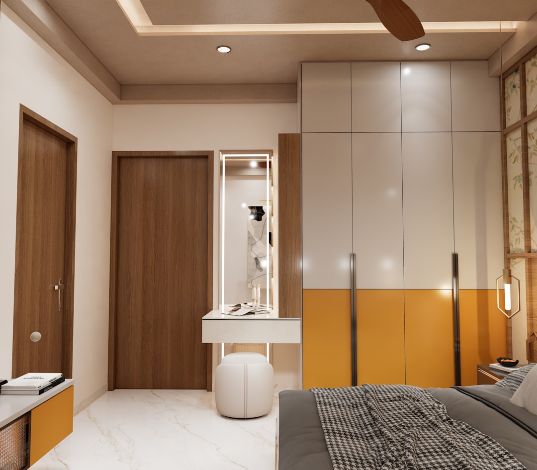
A 10-foot-wide living room is not a design problem. It’s a geometry problem — and geometry responds to specific interventions, not to general advice about “light colors” and “mirrors.” When a space feels like a corridor you’re supposed to sit in, the issue is almost always a combination of furniture scale, sightline obstruction, and the direction your eye travels when it enters the room. Fix those three things with precision, and the room doesn’t just feel bigger. It feels like a different room.
We’ve worked through this scenario in detail — talking to designers, testing layout software, and running our own measurements on typical narrow configurations. Here’s what actually moves the needle.
Start With the Floor Plan Before You Touch Anything
The single most common mistake in a narrow room is moving furniture by feel. You drag the sofa toward the window, decide that’s wrong, drag it back, and two hours later you’re sitting in the same layout wondering why nothing changed.
Before anything moves, measure the room to the inch and sketch it to scale. A 1:24 scale drawing (½ inch = 1 foot) on graph paper is enough. Alternatively, use a free floor plan app and import your laser measure readings — most apps accept input in feet and inches. What you’re looking for is the room’s aspect ratio. If your space is, say, 10 feet wide by 22 feet long, that’s a 1:2.2 ratio. Anything beyond 1:1.8 starts reading as a tunnel, and you need layout moves that interrupt the long axis visually.
The designer’s first move in a narrow room is almost always perpendicular traffic: arranging furniture so the eye doesn’t shoot straight from the entry to the far wall, but instead pauses, turns, and finds a grouping. That pause is what the brain reads as “space.”
The Furniture Decisions That Carry the Most Weight
Scale the sofa correctly — this is not optional
In a 10-foot-wide room, a standard 90-inch (7.5-foot) sofa placed parallel to the long wall leaves 30 inches on one side for circulation. That’s technically walkable but visually suffocating. A sectional is almost always the wrong call here. A sofa in the 72-to-80-inch range, floated off the wall by at least 6 inches, creates a perimeter of breathing room that reads as generosity even when the actual square footage hasn’t changed.
Floating furniture — keeping the sofa away from the wall rather than pushed against it — is one of those moves that feels counterintuitive (less wall space = feels tighter, right?) but reliably opens a room. The gap behind the sofa gives the eye a visual landing point that isn’t a wall.
Orient the rug across the width, not the length
Most people run a rug parallel to the long axis, which reinforces the tunnel. A rug oriented horizontally — wider than it is long relative to the room’s main sightline — physically anchors a seating zone and visually widens the space. If the room is 10 feet wide, a 9x6 rug placed with the 9-foot dimension running wall to wall reads as a broader room. Confirm that any rug leaves at least 18 inches of exposed floor at each side — that border matters.
Use legs, not skirts
Furniture with visible legs — on sofas, chairs, side tables — allows light to travel under the pieces and reach the floor. It sounds minor. In a narrow room with limited light, it can mean the difference between a seating group that feels grounded and one that feels like a blockade. Upholstered pieces that go to the floor read as heavier and visually compress the room.
Light Is a Layout Tool, Not an Afterthought
A narrow room that relies on a single overhead fixture has one plane of light — the ceiling — which emphasizes height over width. The corrective move is to layer light sources at multiple heights: a floor lamp in a corner, a table lamp on each end table, and ideally a directed light source on the wall itself.
Wall-washing — pointing a light source at a wall so it illuminates the vertical surface — makes a room feel taller and wider simultaneously. It’s achievable with a plug-in sconce or a directional floor lamp without touching the electrical. If you want flexibility here, clip-on lights are an underrated tool for testing where wall-grazing light works best before committing to a fixed fixture.
What Paint and Trim Actually Do (and Don’t Do)
The advice to paint a narrow room white is half right. A pale wall color keeps the perimeter receding, which helps. But the more precise move is to paint the two short walls — the ends of the tunnel — a slightly deeper tone than the long walls. This makes the room appear shorter (less tunnel-like) and, by contrast, wider. The difference doesn’t need to be dramatic; even a step or two deeper on the same paint strip is enough for the eye to register.
Trim color matters more than most people expect. Painting baseboards and door casings the same color as the wall (rather than the traditional bright white contrast) removes the visual “edge” that defines where floor meets wall, and the room reads as more continuous. It’s a detail designers use routinely on narrow spaces and oddly shaped rooms alike — you can see the same logic applied in this narrow layout rework where the trim decision was as significant as any furniture move.
One thing that reliably doesn’t help: too many mirrors placed randomly. A single large mirror on one of the short walls, positioned to reflect the room’s best sightline (usually toward a window or a well-lit seating area), creates genuine depth. Four small mirrors scattered across the long wall just create visual noise.
Verify Before You Commit
Any layout change worth making in a narrow room is worth testing at scale before you haul furniture. Tape the footprint of your sofa and coffee table on the floor with painter’s tape and walk around it for a day. Measure the resulting circulation paths — the minimum functional clearance around a coffee table is 18 inches; 24 inches is comfortable. Run those numbers through our room layout calculator to check whether your proposed arrangement actually clears the thresholds, or whether you’re trading one problem for another.
The changes that transform a narrow room aren’t expensive or structural. They’re sequential: get the scale right, interrupt the long axis, layer the light, and handle the paint last. Do them in order. The room that felt like a hallway starts reading like a considered space — not because anything was added, but because the geometry finally has room to breathe.
Your next step: Measure your room’s exact width and length, calculate the aspect ratio, and identify which of the four moves above is most out of alignment. Start there, not with a paint chip.