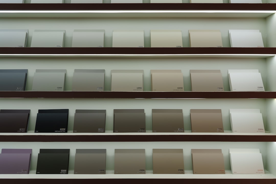
Paint chips lie. Not maliciously, but consistently — and the gap between what a white looks like under a hardware store’s fluorescent lights and what it does to your living room at 4 p.m. on a January afternoon is often significant enough to cost you a full repaint. Choosing white sounds like the safe, neutral move. In practice, it’s one of the more technically demanding color decisions you’ll make in a renovation.
Here’s what’s actually going on, and how to work through it systematically instead of picking by instinct and hoping.
Why White Isn’t One Color
There are hundreds of whites on a standard paint deck, and every one of them has an undertone — a slight lean toward another hue baked into the formulation. The most common undertones in white paints are:
- Warm undertones: yellow, cream, red, or orange — these make a room feel cozy but can read as dingy in a north-facing room with little natural light
- Cool undertones: blue, green, or violet — these photograph well and pair with modern finishes, but can feel cold in spaces that already lack warmth
- Pink/blush undertones: often surprising in person, especially on large wall expanses; more common in “antique” or “heritage” whites
- Gray undertones: the most neutral, but they can shift greener or bluer depending on surrounding surfaces
The undertone isn’t always obvious on a 2×2-inch chip. It becomes visible when you see the color next to a true neutral reference, or when you observe it in the specific light conditions of your room.
The Role of Light Direction — and Why It’s Non-Negotiable
Before you open a paint deck, identify which direction your room faces and note what kind of light it gets at different times of day. This single variable will rule out a large portion of your options.
North-facing rooms receive indirect, cooler light throughout the day. Warm whites — anything with a yellow or red undertone — tend to hold their warmth and often read as more “white” here than they do in brighter rooms. Cool whites can look actively gray or even slightly green in these conditions.
South-facing rooms get direct sun for most of the day, which floods the space with warm light. Cool or gray-toned whites balance well here and can appear crisp and clean. The same paint in a south-facing room that looks elegant may look harsh and blue in a north-facing one.
East-facing rooms get warm morning light and shift cooler in the afternoon. West-facing rooms do the reverse, going warm in the evening. These are the trickiest conditions to predict from a chip — you genuinely need to observe the room at multiple times of day.
The direction your windows face doesn’t change. Your paint choice should work with it, not fight it.
How to Actually Test a White Before Committing
Testing properly takes about a week, and it’s worth every day of it. Here’s the process we’d use:
- Buy sample pots of three to five candidates — not chips, actual paint you can apply to a large patch
- Paint each sample on a 12×18-inch section of the actual wall, ideally in two coats over the existing color; doing this on white poster board that you carry around the room gives you useful flexibility but misses the effect of wall texture
- Observe each sample at four moments: early morning, midday, late afternoon, and under artificial light in the evening — the last test often surprises people; incandescent and LED bulbs with different color temperatures will shift a white dramatically
- Step back to five to six feet, because that’s the viewing distance that matters, not the arm’s-length inspection
- Look at the patches next to your fixed finishes — trim, flooring, cabinetry — and pay attention to whether the white makes those elements look dingy, warm, or sharp
One specific practical note: if your lighting fixtures use bulbs with a color temperature below 2700K, you’re working with warm light; above 4000K, you’re dealing with cool, daylight-adjacent light. Knowing which you have before you start sampling is more useful than most paint consultants will tell you.
If you’re planning to repaint as part of a larger kitchen or room refresh — something like the builder-grade kitchen color upgrade approach — test your white against the new materials, not just the existing ones.
Matching Whites to Your Fixed Finishes
White paint next to white trim is where a lot of renovations go sideways. If your trim is a warm, creamy white and you paint the walls a cool blue-white, the trim will read as yellow. If the wall is warmer than the trim, the trim looks stark. Neither is inherently wrong as a design choice, but it has to be intentional.
The general approach that tends to work:
| Trim finish type | Wall white to consider |
|---|---|
| Warm/cream trim (older homes, traditional millwork) | Warm-to-neutral white on walls, or paint trim and walls the same color to sidestep the comparison entirely |
| Bright, cool white trim (modern or newly installed) | Cool or gray-toned white that reads as softer, creating contrast without clash |
| Natural wood trim or exposed wood elements | Warm whites with yellow or cream undertones tend to read as intentional; cool whites can look clinical |
| No trim / frameless minimalist profile | You have more latitude — the wall white only has to answer to the floor and ceiling |
Ceilings are their own consideration. Painting ceilings the same color as walls in a slightly different sheen (flat on the ceiling, eggshell on walls) is a more forgiving approach than trying to match two different whites — which almost never resolves cleanly.
Sheen Matters More Than Most People Expect
The same white in flat, eggshell, and satin finishes reads as three slightly different colors in the same light. Higher sheens reflect more light, which tends to brighten and slightly shift the undertone toward the visible spectrum. Flat finishes absorb light, which makes colors look marginally darker and more matte — useful in rooms where you want to suppress the reflective quality of a cool white.
In high-traffic areas or rooms that take humidity — kitchens, bathrooms, entryways — a flat finish isn’t practical regardless of how it looks. Eggshell (typically a sheen level around 10–25 on a gloss scale, though this varies by manufacturer) balances washability and a low visual sheen. Satin makes sense for trim because you want that slight differentiation from the wall.
For smaller spaces where you’re already trying to maximize the sense of light and volume, a compact-space approach to color and surface finish — using reflectivity strategically — is worth reading through before you finalize.
Before You Go to the Paint Counter
Run your room through the following checklist. It will save you at least one repaint:
- Identify which direction your windows face
- Note the color temperature of your primary light fixtures (check the bulb box for Kelvins)
- Pull your trim, flooring, and cabinet colors — list whether each reads warm or cool
- Buy samples of three to five whites with different undertones, not all from the same family
- Paint large patches directly on the wall and observe for at least five to seven days
- Make your decision based on the evening artificial-light test, not the midday test — that’s when most rooms look worst
One more thing worth doing before the painter arrives: measure your walls and calculate your actual square footage so you’re ordering the right quantity. A standard interior wall paint covers roughly 350–400 square feet per gallon in a single coat, but that range shifts with wall texture and the darkness of what you’re painting over — confirm coverage estimates with the specific product’s spec sheet.
The payoff of slowing down this decision is that white done right is genuinely the most durable choice you can make: it accommodates changing furniture, shifts with the seasons, and photographs cleanly. Getting the specific white right is the only part that requires work.