The most common reason a kitchen feels dated isn’t the cabinet doors or the backsplash — it’s the color story, or the absence of one. Flat beige walls, white trim indistinguishable from the ceiling, and appliances that sit in a visual void: that combination doesn’t read as neutral, it reads as unfinished. Four deliberate paint choices, applied in the right sequence across different surfaces, can reframe every fixed element in the room without touching a single cabinet hinge.
This isn’t theory. Painters and color consultants consistently point to the same principle: kitchens with a single wall color and no contrast feel smaller and less considered than kitchens where two or three additional surfaces carry coordinated but distinct tones. The math on this approach is also hard to argue with — a gallon of interior paint runs roughly $35–$70 at most hardware retailers (confirm current pricing locally), which makes color one of the highest-leverage moves in any kitchen renovation budget.
Here’s how a four-color strategy actually works in practice.
Color One: The Wall Tone That Sets the Room’s Mood
The main wall color is where most people start and stop, which is exactly why it rarely does enough on its own. Choosing a wall color means choosing how natural and artificial light behaves in the space across a full day — not just how a 2-inch paint chip looks under fluorescent store lighting.
Before committing, apply a sample patch at least 12 inches square, directly on the wall, and live with it for 48 hours. Check it at 7 AM, noon, and 8 PM. A warm sage that looks sophisticated at midday can turn murky green under incandescent light after dark. A cool gray that reads serene in morning light sometimes turns flat and institutional by evening.
In kitchens with limited natural light, slightly warmer undertones in the LRV (light reflectance value) range of 55–70 tend to hold up better across light conditions than very cool or very dark choices. That said, painting a small kitchen dark isn’t automatically a mistake — the effect depends entirely on how the other three colors are managed around it. Our piece on dark cabinet transformations gets into that trade-off in more detail.
Color Two: The Ceiling, Which Everyone Treats as an Afterthought
Painting the ceiling the same flat white as every other ceiling in the house is a choice — just usually not a considered one. The ceiling is roughly the same square footage as the floor. Ignoring it means surrendering about half the room’s visual real estate to a non-answer.
A ceiling painted one to two shades lighter than the wall color creates continuity without the abruptness of a hard-contrast break. This technique visually lifts the ceiling in rooms where the walls are mid-tone or deeper. Conversely, a ceiling painted in a very slightly warmer tone than the walls — think the wall color with a touch more cream — can make a large, echoey kitchen feel more intimate and considered.
Flat or matte finish on the ceiling is the standard call, since it absorbs light rather than bouncing it back, which hides imperfections in older plaster or drywall. One specific exception: in kitchens with adequate ventilation and wipeable wall paint already specified, some designers use eggshell on the ceiling to add just enough reflectivity to keep the room from feeling heavy.
Color Three: The Trim and Woodwork, Where the Room Gets Its Edges
Trim color is the detail that separates a polished kitchen refresh from an amateur one. White trim on beige walls looks like the painter ran out of ideas. But the right trim choice — even if it’s still technically a white — sharpens every cabinet edge, window frame, and baseboard into a clean visual line.
There are meaningful differences between warm whites (those with yellow, red, or pink undertones) and cool whites (those leaning blue or gray). Running a warm-toned wall color against a cool-white trim creates a subtle visual tension that can read as unintentional. Matching undertones — warm wall, warm trim white; cool wall, cool trim white — is the quieter, more reliable move.
Semi-gloss is the default finish for trim in kitchens for practical reasons: it holds up to repeated wiping, resists moisture better than eggshell, and reflects light in a way that defines edges clearly. In older homes with trim that has dings and irregularities, a satin finish hides surface flaws better while still offering durability.
If you’re unsure whether your kitchen’s current trim situation is actively working against the space, it’s worth reviewing what other dated choices might be compounding the problem — our look at kitchen trends that don’t add value covers several that overlap with poor trim and color coordination.
Color Four: The Accent Surface — Island, Open Shelves, or a Single Statement Wall
This is where the four-color strategy earns its reputation for transforming a room. An accent color — applied to a kitchen island, the interior of open shelving, or a single wall behind the range — gives the eye somewhere to land. Without it, even a well-executed three-color plan can feel like it’s waiting for something.
The accent doesn’t have to be bold to be effective. A muted terracotta on an island base, a dusty navy on open shelving backs, or a saturated forest green on a single wall each accomplish the same structural goal: they create depth and a focal point simultaneously.
A few practical considerations before committing to an accent surface:
- Prep matters disproportionately here. An accent color shows brush strokes, lap marks, and poorly filled holes more visibly than a neutral wall. Sand, prime, and use a high-quality brush or small foam roller.
- Test the accent color against your fixed finishes first. Hold a large paint chip (or a dried sample board) against your countertop material, hardware finish, and any tile. An accent that clashes with the grout color or hardware undertone will undercut the whole scheme.
- Two coats is a minimum. Deeper accent colors frequently need three on porous or previously light-painted surfaces. Skimping here shows.
- Finish choice affects the feel. An eggshell or satin finish on an accent wall reads more livable and less “feature wall” than a high-gloss, which can feel commercial or dated depending on the room.
The Sequence That Makes It Work
Color selection matters, but application order determines whether the four choices cohere. Paint the ceiling first, then walls, then trim. Apply the accent color last, once the surrounding palette is fully dry and visible, so you can adjust if the relationship between colors looks different at full scale than it did on chip.
If the kitchen’s existing lighting situation is working against any of these efforts — flat overhead fixtures that flatten color and create unflattering shadows — it’s worth addressing that in parallel. Even inexpensive supplemental lighting can change how paint reads in a space; our piece on clip-on lights and task lighting options has practical starting points that don’t require any electrical work.
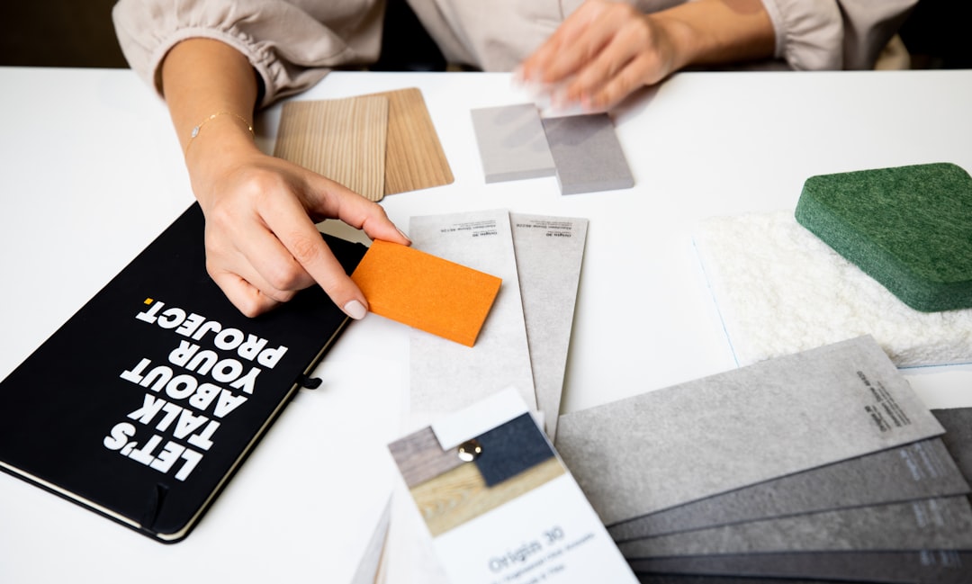
The specific actionable next step: before purchasing a single quart of sample paint, pull all your fixed kitchen finishes — a cabinet door, a countertop offcut, a hardware sample, a tile piece — into one spot under your actual kitchen light and photograph them together. That photo becomes your reference when selecting the four colors. Everything on that reference image is immovable; the paint has to work around it, not the other way around.