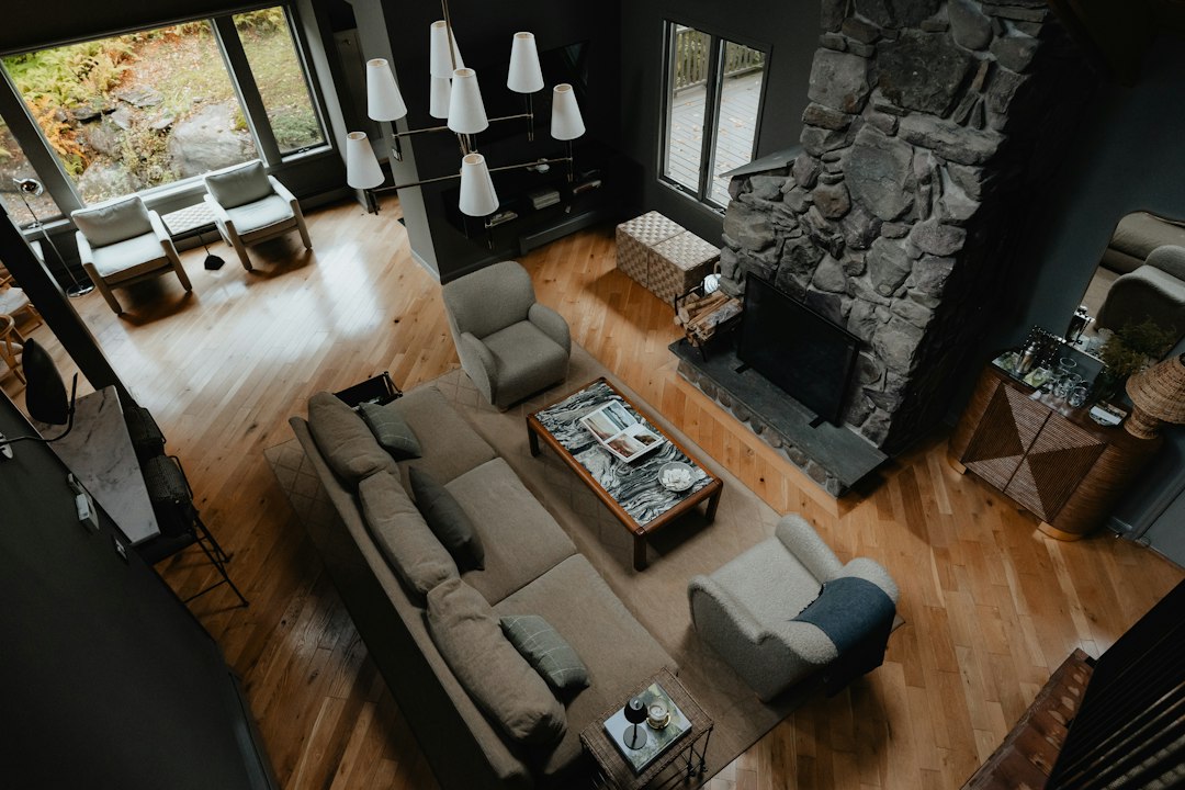
The conventional checklist for tiny apartments is well-worn: keep furniture low-profile, stick to a single light color palette, skip the room dividers, never hang curtains below the ceiling, don’t dare use pattern on more than one surface. It’s sensible advice on paper. It’s also advice that a well-documented 250-square-foot rental keeps breaking, wall by wall, with results that hold up under the kind of deliberate spatial scrutiny we try to apply here.
That’s worth unpacking — not to celebrate rule-breaking for its own sake, but because the rules themselves are often simplified heuristics that obscure the actual spatial mechanics underneath. When you understand the mechanism, you can decide when the rule applies and when it doesn’t.
The Rule That Gets Broken First: Keep Everything Light
The instinct to coat every surface in white or warm cream in a small space comes from a real place. Light colors reflect more lumens back into the room, and a higher ambient light level does compress the perception of distance between walls — in a counterintuitive way, brighter environments tend to feel more spacious than dim ones at identical square footage.
The problem is that “light color everywhere” produces uniformity, and uniformity eliminates visual anchors. When a room has no clear focal point, the eye bounces around and actually registers the boundaries of the space more consciously. A single dark or saturated wall — particularly the one farthest from the entry — pulls the eye forward and makes you stop scanning the perimeter. You’re looking through the room to a destination, not at the walls closing in.
In a 250-square-foot layout where the entry flows directly into the living area, this matters immediately. A deeply painted accent wall in that sightline can make the room feel longer along its dominant axis, even while the adjacent walls stay lighter. The spatial perception shifts from “enclosed box” to “room with depth.” She painted her small kitchen dark, and the result reads noticeably larger — same floor plan, same square footage.
The measurement-based way to think about it: in a space that’s roughly 12 feet wide and 20 feet long (a plausible 240 sq ft rectangle), the long axis is what you want to emphasize. Anything that shortens the eye’s travel along the 20-foot run shrinks the room. Anything that lengthens it — including a focal-point color at the far end — stretches it.
The Rule That Gets Broken Second: Avoid Dividing the Space
Conventional wisdom says open plans feel larger, and therefore anything that breaks up a 250-square-foot interior is working against you. That’s true if division means adding a solid partition that kills light and sightlines. But it’s not true for a low bookcase, a partial-height shelving unit, or a fabric curtain that runs on a ceiling-mounted track.
What a thoughtful divider actually does in a very small space is create two distinct behavioral zones. Without any zone differentiation, the whole 250 square feet reads as “the room,” and every activity — sleeping, eating, working — competes for the same visual real estate. The moment you create even a soft boundary, the brain registers two spaces. Two defined spaces feel larger than one undefined one of the same area. Counterintuitive, but consistent with how we perceive domestic environments.
Specifically: a low credenza or open-backed bookshelf positioned perpendicular to the long axis, at roughly 30 to 36 inches of height, creates a zone break while keeping the full ceiling-to-floor sightline intact. You see over it, light moves through it, but the room now has a “sleeping side” and a “living side.” That’s not a cramped studio anymore — it’s a one-bedroom apartment without a wall.
Curtains hung from ceiling-height tracks (installed at the actual ceiling, not at the top of a window frame) work similarly. The vertical drop makes the ceiling feel higher, and the curtain can slide out of the way entirely when the zone distinction isn’t needed.
The Rule That Gets Broken Third: Limit the Furniture Count
“Fewer pieces, breathing room” is advice designed for people who’ve overcrowded a space with redundant furniture. It’s not a law of physics. A 250-square-foot rental can support more distinct functional pieces than you’d expect, as long as each piece is doing real work and the clearance paths between them are maintained at usable widths.
The critical number here is 36 inches for a primary circulation path — the main route you walk every time you move through the room. Secondary paths (between bed and wall, between desk chair and dresser) can work at 24 inches, and in genuinely tight spots 18 inches is functional for infrequent access. Run a tape measure and draw it on graph paper at 1 inch = 1 foot before you commit to a layout. A laser distance measure (any sub-$30 unit will read to ±1/16-inch accuracy) gets you the wall-to-wall dimensions faster than a tape in tight corners.
The clearance check usually reveals that a space everyone assumed couldn’t hold both a desk and a full-size sofa actually can — with a couple of inches to spare on the secondary path. What fails isn’t the count of pieces, it’s the placement. A piece positioned parallel to a wall when it should be angled, or centered in the room when it should hug the perimeter, wastes the circulatory buffer that the count-reduction rule was trying to preserve.
If you want to pressure-test an arrangement before moving anything, our floor plan calculator won’t replicate a full CAD layout, but running the basic room dimensions through it will show you quickly where the circulation math falls apart.
What the 250-Square-Foot Layout Actually Teaches
The underlying lesson isn’t that small-space rules are wrong. Most of them encode something real about how perception and function work in constrained footprints. The lesson is that the rules are solving for a median problem in a median space, and a specific 250-square-foot room might not have that problem at all.
A rental with nine-foot ceilings doesn’t need low furniture to avoid making the room feel squat. A unit with a large east-facing window doesn’t need a pale palette to feel lit — it needs window treatments that control glare without killing the light. A layout where the kitchen occupies one full wall is already functionally zoned; it doesn’t need the living area stripped down to a single sofa to “keep it simple.”
This is why the measurement step comes before the design decision every time. Know the ceiling height to the inch. Know the window sill height. Know the exact clearance between the entry door swing and the nearest wall (a number that eliminates an entire category of furniture options by itself). Once you have those numbers, you’re not following generic advice — you’re solving a specific spatial problem. The best part of a 550-square-foot duplex we’ve covered before wasn’t its size, it was the layout, and the same logic applies two-thirds of the way down the size scale.
A Specific Starting Point
Before accepting any small-space rule as binding, take 30 minutes to do a proper dimensional survey of the room: wall lengths, ceiling height, window placement and sill heights, door swing radii, and the location of any fixed elements (radiators, outlets, thermostats) that constrain furniture placement. Draw it on grid paper or enter it into a basic floor plan tool. Then identify the primary sightline from the entry — the direction your eye travels first when you walk in.
Every design decision in a 250-square-foot space should serve that sightline or at minimum not work against it. Once you know what you’re actually optimizing for, you can evaluate each conventional rule on its merits rather than following it because small spaces are supposed to be handled a certain way.