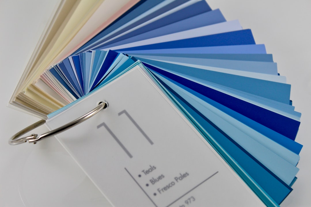
Every paint advice column written in the last fifty years has pushed the same line — white opens up a small room, dark closes it down. That conventional wisdom is probably responsible for ten thousand pale, washed-out rental kitchens that feel clinical rather than expansive. A growing number of homeowners are discovering the opposite move, and it actually works — not as a design stunt but as a principled use of how the eye reads a space.
Here’s what’s happening visually when it works, what has to be true about the room for it to work, and how to execute it without ending up with a kitchen that feels like the inside of a cabinet.
Why Dark Paint Can Make a Room Read Larger
The mechanism is counterintuitive but logical once you understand it. When walls are painted a pale color, every scuff, corner shadow, and surface irregularity registers as a separate visual event. Your eye tracks from one edge to the next, measuring the room continuously. Paint the same walls a deep, saturated tone — charcoal, inky navy, dark forest green, even a moody eggplant — and those corners, shadows, and surface variations dissolve into the field. The wall reads as a continuous plane rather than a sequence of interruptions.
The result is that the room’s actual footprint becomes harder to pin down. The boundaries go soft. Designers who work in small spaces sometimes call this “dematerializing” the shell — when the enclosure disappears optically, what you notice instead is the cabinetry, the light, and the objects in the space.
This is not a new idea. Theater set designers have used dark-painted black-box stage environments for exactly this reason for decades. What’s new is homeowners trusting it in a kitchen, which has historically carried a “bright and airy” mandate that doesn’t actually serve every floor plan.
What the Room Needs Before You Open a Can
Dark paint amplifies what’s already true about a room. That’s the honest caveat no one leads with.
A small kitchen with one north-facing window and a 7-foot ceiling can go dark — but it needs deliberate help from other elements to avoid reading as oppressive. Before committing to a full paint-out, audit the room for these conditions:
- Natural light, even indirect. One window is enough if it lets in any daylight at all. What you’re working against is zero natural light — a purely interior kitchen with only recessed fixtures overhead. That scenario is risky.
- Light-reflective surfaces elsewhere. Dark walls work best when cabinetry, countertop, or hardware picks up and bounces light. A cream-painted cabinet face, a polished or honed light stone counter, or even simple brushed brass hardware all help. A builder-grade kitchen backsplash upgrade that includes a glossy tile will do real work here — the reflectivity is functional, not decorative.
- Good artificial lighting. This is the piece most people underestimate. If the existing kitchen lighting is three old pot lights on a dimmer, the dark walls will be working against inadequate fixtures rather than being showcased by them. Add under-cabinet lighting, or consider task-specific sources. Clip-on and plug-in options can fill gaps without electrical work — our roundup of clip-on lights covers practical formats worth considering before you wire anything.
- Reasonable ceiling height. An 8-foot ceiling reads better dark than a 7-foot one. If the ceiling is 7 feet or under, consider painting only the walls and leaving the ceiling the lightest color in the room — or a soft warm white — to maintain the sense of vertical space.
Choosing the Right Dark
Not all dark paint behaves the same. A flat or matte finish absorbs light almost completely, which deepens the dematerializing effect but also shows fingerprints and grease in a kitchen context — and kitchens generate both. An eggshell finish (typically a 10–20% sheen) reflects slightly more light off the surface, which helps the room feel less cavernous, and it wipes clean without the finish rubbing off under repeated scrubbing. Satin (roughly 25–35% sheen) is even more durable and slightly more reflective — useful if the kitchen is high-traffic or the household includes young children.
Color temperature matters more with dark paint than with light paint. A very cool charcoal (blue-gray undertones) can feel cold and institutional in a kitchen, especially under warm-white incandescent or LED bulbs, because the contrast between the wall and the light source is harsh. Warmer darks — green-blacks, brown-tinged charcoals, deep khaki tones — tend to read more inviting under standard residential lighting. The safest test is to apply a large sample patch (at least 12 by 12 inches, ideally bigger) and observe it at three different times: midday, late afternoon, and after dark with only artificial light running. The paint will look like three different colors across those conditions.
Also check the undertone against your cabinet finish. Dark teal cabinets can look sophisticated paired with a near-black wall, but if the undertones clash — a blue-toned cabinet against a green-toned wall, say — the room starts fighting itself rather than reading as unified.
The Ceiling Question
Painting the ceiling the same dark color as the walls is the move that separates a “dark accent wall” from a genuine spatial illusion. A full paint-out — all four walls plus ceiling, same color — is what actually makes the boundaries dissolve. The corner where wall meets ceiling disappears, and the room stops announcing its own dimensions.
This sounds dramatic. In practice, it reads as cozy and deliberate in photographs and in person, particularly in kitchens with decent under-cabinet or pendant lighting that creates a bright focal zone within the dark shell. The light sources become the stars of the room; the surfaces recede.
If the ceiling is low and you’re not ready to commit to a full paint-out, paint the ceiling one to two values lighter than the walls in the same hue family. It will still read as coherent rather than as a jarring white ceiling floating above dark walls.
Before You Pick Up a Brush
Run the actual dimensions of your kitchen through a floor-plan tool or a simple layout sketch before you buy paint. Knowing whether you’re working with 80 square feet of wall surface or 140 square feet affects how many gallons you need — and dark paints often require two full coats over a light base, especially in deep colors. Budget accordingly.
If this is a rental or a home you’re planning to sell in under three years, do the math on repainting costs before committing to a very dark shade. Rolling over deep navy with white requires a solid primer coat plus two finish coats — factor that in as part of the project cost, not as a hypothetical future expense.
Your concrete next step: buy a sample pot (or two, in the same dark family but different undertones) and paint two 12-by-18-inch swatches on adjacent walls in the corner where your light is worst. Give them 48 hours to fully cure, then evaluate in morning and evening light before buying full quantities. That $10 test will tell you more than any color swatch card.