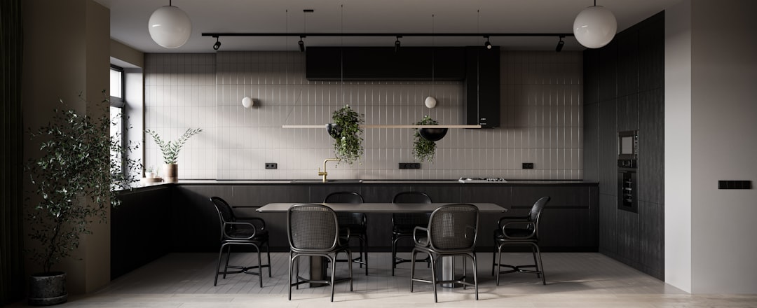
The complaint wasn’t unusual: the kitchen felt like you were walking through it rather than in it. A narrow galley footprint, overhead cabinets running the full length of both walls, and a single window positioned too high to do much good. The owners called it a tunnel. That’s not an exaggeration — measured wall to wall, the usable floor width was under six feet. Cook something with a partner and you’re negotiating every pivot.
What happened over the course of a phased modern farmhouse renovation is worth documenting carefully, because the decisions that made the biggest difference weren’t the dramatic ones. They were the smaller, sequenced calls: which wall to open, which materials to hold onto, and what “farmhouse” actually means when you’re not just shopping a trend.
Start with the Structural Question You’d Rather Avoid
Every tunnel kitchen has at least one wall that, if removed or altered, would transform the space. The owners here had one — a half-wall with upper cabinets on both sides that divided the kitchen from a mudroom entry. The temptation was to ignore it, because structural work costs money and introduces uncertainty.
They didn’t ignore it. A contractor confirmed the half-wall was non-load-bearing after pulling the permits and checking the joist direction — a step that sounds obvious but gets skipped when homeowners are trying to control costs. Removing it entirely opened roughly 40 inches of additional perceived width on one end of the kitchen, even though the square footage technically changed very little.
That’s the thing about tunnel kitchens: the problem is usually proportion, not area. A space that’s 8 feet wide reads completely differently from one that’s 5’10”. Run your actual measurements against a floor plan before you budget anything. You may find that one modest structural move shifts the experience of the entire room.
Cabinet Decisions That Actually Changed the Light
Upper cabinets were a large part of why the space read dark. Two full runs of raised-panel uppers — stained a medium walnut that had gone from warm to just dim over the years — kept the upper third of the room heavy.
The renovation team made two moves here, and both matter:
- Removed the uppers on the window wall entirely. In their place: open shelving in white-painted poplar at two depths (9-inch and 12-inch), anchored to the wall with heavy-duty shelf pins rated for the weight. No decorative brackets — those would have added visual clutter.
- Replaced the remaining uppers on the opposite wall with inset-front cabinets in a matte white finish. The inset door sits flush with the face frame rather than proud of it, which removes the shadow line that overlay doors create.
That shadow line sounds like a minor detail. In a narrow kitchen, though, it compounds. Every overlay door on a standard frameless cabinet throws a 1/4-inch reveal of shadow at the hinge side. Multiply that across eight doors and you’re looking at a wall that visually texture-loads the room. Inset fronts don’t do that.
If you’re evaluating whether your own cabinet choices are dated or actively working against your space, it’s worth a look at 9 dated kitchen trends that don’t add value to your home — the overlay issue shows up there in a different context.
The Lighting Plan Was Built in Layers, Not Installed as an Afterthought
Old kitchen: a single can light in the center of the ceiling and under-cabinet fluorescent strips that buzzed. No dimmer. No pendant positioning over the sink.
New kitchen: three recessed wafer lights on a dimmer (rated at 650 lumens each, 2700K color temperature to keep the warmth against the white cabinets), two pendants over the peninsula anchored at 66 inches from floor to pendant bottom, and new under-cabinet LED tape at 400 lumens per foot running the length of the prep wall.
The 66-inch pendant height is worth noting specifically. A lot of installation guides say “30 to 36 inches above the counter surface,” which puts a standard pendant at roughly 66 to 72 inches from the floor depending on counter height. At the low end of that range, the pendants stay visible from across the room without interrupting sightlines when someone is standing at the sink. It’s a tighter clearance in a narrow kitchen, and the owners confirmed it before ordering. Measure twice — then check the cord length on the pendant itself, because many ship with less than 60 inches of cord and a ceiling that’s 9 feet up will require an extension.
Farmhouse Without the Clichés
“Modern farmhouse” has accumulated a lot of cargo over the past decade — shiplap applied to things that have no structural reason to exist, black fixtures on everything regardless of whether the room supports that contrast, barn doors used as a design shorthand instead of a spatial solution.
This renovation used the language selectively:
- Shiplap: one wall only — the short wall behind the range, painted in a warm off-white (Benjamin Moore OC-17, White Dove, if you want the specific chip) to distinguish it from the adjacent plaster walls without over-announcing itself.
- Hardware: brushed nickel pulls, not matte black. The choice came down to the amount of natural light; in a room with limited afternoon sun, matte black hardware tends to recede and flatten. Brushed nickel reflects the task lighting back into the room.
- Counters: honed white quartzite, not quartz. The distinction matters practically — quartzite is a natural stone and requires sealing roughly once a year (more in a busy kitchen), while engineered quartz does not. The owners chose quartzite for the grain variation, which moves away from the uniform look engineered slabs can have. Budget accordingly: as of our last check, installed honed quartzite typically runs meaningfully higher per square foot than standard engineered quartz, though regional pricing swings are significant enough that you’d want to confirm locally.
What the “Retreat” Part Actually Required
The word retreat gets thrown around easily. In this case it had a specific meaning: a kitchen you could spend time in without feeling like you were standing in a corridor waiting for the next task.
Two elements made that possible beyond the structural and lighting changes.
The peninsula added at the mudroom end — 48 inches long, 18 inches deep, with two counter-height stools — created a place to sit without being in the cook’s path. It sounds small. It changes the social geometry of the room entirely.
The other element was color temperature consistency. Every light source in the final kitchen runs at 2700K — pendants, recessed wafers, under-cabinet tape. When you mix color temperatures (say, 3000K recessed with 2700K undercabinet), surfaces read differently depending on where the shadow falls. The honed quartzite looked gray under mixed lighting in the pre-renovation space. Under consistent 2700K it reads cream, which pulls the room warmer without any paint change.
If you’re dealing with a similarly dated or cramped cooking space and want a sense of what a light refresh alone can accomplish first, a builder-grade kitchen backsplash swap is often the lowest-risk high-visibility move to start with — we walked through one example in detail in our piece on a builder-grade kitchen getting a pop of color with an easy backsplash upgrade.
The Practical Next Step
Before you schedule a contractor walkthrough or start pulling cabinet door samples, do this first: measure every dimension of your current kitchen at counter height, at 54 inches (eye level when seated), and at the ceiling. Photograph those measurements next to a scale reference. Then stand at each work zone — sink, range, prep area — and note where your line of sight hits a wall, a cabinet face, or open air.
That exercise will tell you more about where your tunnel problem actually lives than any mood board can. The solutions in this renovation were targeted because the owners knew exactly which dimensions were wrong and which ones, honestly, were fine.