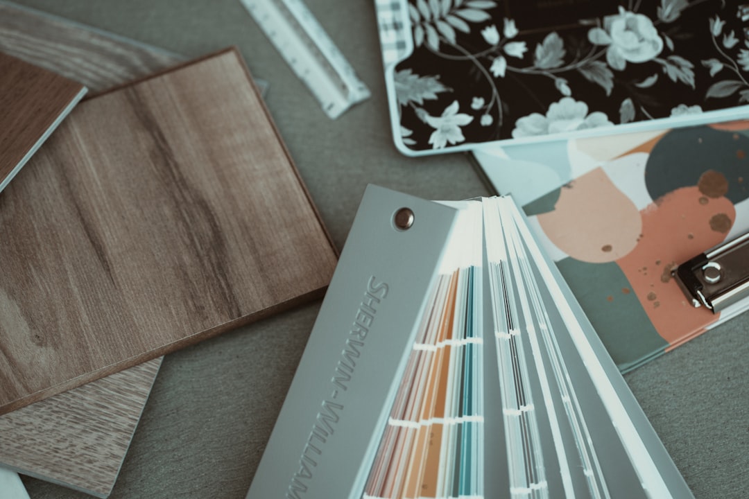
Sherwin-Williams named Mossy Boulder (SW 9683) its Color of the Year — a warm, earthy green with enough gray in it to stay on the calm side of “nature-forward.” The company’s color forecasters describe it as grounding, restorative, and deliberately connected to the outdoors. That framing is useful not because it’s marketing language you should repeat, but because it tells you exactly where this color works and, maybe more usefully, exactly where it doesn’t.
Green-grays have been circling interior design conversations for a few years now. Mossy Boulder lands in a specific register: muted enough to read as a neutral in low light, alive enough to shift toward sage or olive depending on the direction of your windows. That behavior is the practical detail most people miss when they fall for a chip at the hardware store.
What the Color Actually Does on a Wall
Paint colors don’t exist in isolation — they respond to the light sources around them, the undertones of adjacent surfaces, and the time of day. Mossy Boulder’s green-gray sits in a range where it can appear nearly taupe under incandescent or warm LED bulbs and distinctly mossy under daylight-balanced lighting or north-facing natural light.
Before you commit a full gallon to a living room, test it in the room’s actual conditions:
- Paint at least two 12-by-12-inch swatches on separate walls — one that gets direct light at some point in the day, one that stays in shadow
- Check the swatch at morning, midday, and evening under your existing artificial lighting
- Hold a white sheet of paper next to the dried swatch — it will reveal undertones that aren’t obvious on their own
- If you’re working with warm-toned wood floors or cabinetry, note whether the swatch shifts toward yellow-green or stays gray; either outcome is workable but they pull you toward different accent choices
The typical quart-size sample costs a few dollars and saves a real repaint, which — depending on room size and whether you’re hiring labor — can run anywhere from a few hundred to well over a thousand dollars. Confirm local labor and material rates before budgeting.
Rooms Where “Bringing the Outside In” Is More Than a Tagline
The pitch works best in rooms that actually have a visual connection to the outdoors. A Mossy Boulder wall behind a large window that looks onto a tree canopy or a green backyard genuinely does blur the boundary between inside and out. The color echoes what’s on the other side of the glass without competing with it.
Rooms without that connection require more intention. A basement media room or an interior bathroom painted in this tone needs to work harder — typically through artificial lighting that mimics daylight (look for bulbs rated around 5000K to 6500K color temperature for a neutral-to-cool daylight effect) and through companion materials that reinforce the earthy palette rather than fighting it. Raw linen, matte terracotta tile, and unfinished wood grain all tend to cooperate with warm greens. High-gloss white trim, on the other hand, can make the same green look cold.
We’ve seen how strategic color placement can transform a space from flat to intentional, and the same logic applies here: the color alone is rarely the whole answer.
Where It Pairs, and Where It Clashes
Mossy Boulder is anchored enough to serve as a backdrop for a range of accent choices, but it has opinions. A few combinations worth thinking through:
Pairs well with:
- Natural brass or unlacquered bronze hardware (the warm metal pulls out the earthy quality of the green)
- Off-white and cream rather than bright white for trim — bright white can make the green look unexpectedly cool
- Deeper terracotta or rust tones for accent furnishings
- Warm walnut or teak wood tones for furniture and shelving
Can clash with:
- Cool grays elsewhere in the same sightline — the two neutrals fight each other in a way that reads as unfinished
- High-chroma jewel tones in adjacent rooms without a strong transitional element
- Chrome fixtures in an otherwise warm-toned room — the contrast can feel accidental rather than deliberate
If you’re working through a whole-room refresh with multiple elements changing at once, running through a seasonal refresh approach can help sequence the decisions so you’re not repainting twice.
The Ceiling Question
One application that gets underused: painting the ceiling in the same color, or close to it. It reads as unusual in photos but functions differently in person — the room feels enclosed in a good way, more like a sheltered clearing than a box with a white lid on it. With a muted green-gray, a ceiling application works particularly well in rooms with lower ceiling heights where you’d expect the color to feel oppressive and it simply doesn’t.
If you try it, use the same color in a flat or matte finish on the ceiling and a low-luster (eggshell or satin) finish on the walls. The difference in sheen creates a visual distinction even when the color is identical, so the ceiling doesn’t read as a mistake.
The thing to avoid is trying to “lift” the ceiling by going a shade or two lighter — that tends to produce a slightly off version of the wall color that looks more like a mixing error than a design choice. Commit to the full tone or go back to white.
Making the Color Work in Practice
Color of the Year announcements often function as a forecast of what will be stocked widely and discounted eventually — they’re less a decree than a signal about which direction the broader market is leaning. Mossy Boulder, as of this writing, fits into a sustained move toward biophilic design references, quiet-palette interiors, and the general pull away from the cold gray domination of the previous decade.
That context is useful if you’re renovating with resale in mind, but it’s not the deciding factor for your specific room. The deciding factor is whether the color does what you need it to do under your actual conditions.
Before anything else: measure your room’s natural light, buy two sample pots if you have rooms with notably different exposures, and live with the swatches for 48 hours before buying paint by the gallon. That single step eliminates most of the regret we hear about with color choices — and at current paint prices, it’s not a trivial saving.