Real estate agents spend a lot of time advising sellers on what to fix, paint, and stage before a listing goes live. The ceiling is almost never in that conversation — and that’s the problem. A flat white ceiling is what you do when you’ve stopped thinking. It’s the renovation equivalent of leaving a blank in a form.
The claim making the rounds in staging and design circles right now is that a specific ceiling color — most commonly a soft, slightly warm off-white with a hint of blue-gray or blush, or in bolder cases a deep contrasting tone pulled from the room’s trim or millwork — creates a perception of volume and finish that plain white can’t achieve. Agents who’ve adopted this framing are reporting faster client interest at open houses, though of course individual results depend on the room, the light, and the overall palette. What’s actually driving that response is worth unpacking, because the mechanism is specific and learnable.
Why White Ceilings Are Underperforming
Standard flat white ceiling paint — the kind that comes in five-gallon buckets at every home improvement store — reflects light evenly and without variation. In a well-lit room that sounds ideal. In practice, flat white reads as slightly cold under LED lighting, and in rooms with low natural light it can create a chalky, unfinished feeling rather than the crisp, clean effect most sellers are aiming for.
The deeper issue is contrast. A bright white ceiling against white or light-gray walls creates almost no visual boundary. The eye struggles to read where the wall ends and the ceiling begins, which in lower-ceilinged rooms (the 8-foot standard in most American construction from the 1970s through the early 2000s) actually compresses the perceived height rather than expanding it.
Agents and stagers who’ve moved away from the default white often cite one of two approaches:
- Warm off-white or barely-there blush: Creates a subtle visual warmth that photographs better under standard real estate lighting conditions, and reads as more deliberate than blank white.
- Deep contrasting color: Particularly effective in rooms that already have good ceiling height (9 feet or more), or in spaces like a study, dining room, or primary bedroom where a more intimate feel is an asset rather than a liability.
Neither approach is universally right. The ceiling color decision lives downstream of at least three other choices: wall color, natural light direction, and flooring tone.
The Specific Color Most Often Named
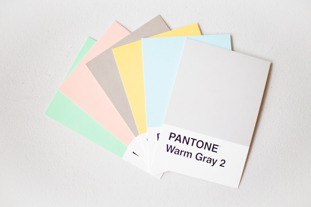
When agents reference “this color” in the context of ceiling upgrades, they’re frequently pointing toward something in the blue-gray family — muted, low-saturation, with enough warmth to avoid reading as industrial. Think of it as the kind of color you’d see on a clear sky reflected in still water, rather than the flat, cool blue of a corporate office partition.
The reason this reads well in property imaging isn’t arbitrary. Property photography shot under mixed lighting — which is most residential real estate — tends to render true white as slightly blown out in exposures balanced for the room’s walls and furnishings. A ceiling with a soft undertone retains definition in those shots instead of disappearing into overexposure. For anyone running their own listing photos or working with a photographer using a wide-angle lens and a fill flash, this distinction is not theoretical.
That said, we’d caution against treating any single color as a universal answer. Run the room against natural light at multiple times of day before committing. The same swatch that reads as barely-there lavender at noon can shift noticeably toward gray by 4pm depending on window orientation.
How to Execute This Without Overcomplicating It
The ceiling is one of the lower-cost, higher-impact moves in a pre-listing renovation budget — labor-light if you’re doing it yourself, and generally not a job that justifies a full painter’s day rate if the room is already clear and prepped. A reasonable execution checklist:
- Sample the wall and ceiling together. Paint large swatches (at least 12” × 12”) of your candidate ceiling color directly on the ceiling near each wall, and live with them for two full days across different lighting conditions.
- Account for sheen. Ceiling paint in a flat or matte finish absorbs light; eggshell bounces it. In rooms being staged for photography, a matte finish generally hides imperfections more reliably — skim-coat repairs, old texture patches, hairline cracks.
- Check against the trim. If the trim is painted bright white (OC-17 or similar), a ceiling with heavy warm undertones can create an unwanted yellow cast near the crown molding. Match undertones, don’t fight them.
- Don’t skip the corners. Cutting in carefully at the ceiling-wall junction is where amateur paint jobs read as amateur. Take the time, use a quality brush, and don’t rely on painter’s tape alone — it can pull fresh paint off walls with poor adhesion.
For rooms where you’re already reconsidering the full palette, a ceiling update pairs well with a kitchen or living room refresh. We’ve covered how a builder-grade kitchen can be transformed with a focused color decision — the ceiling is often the finishing move that ties that kind of targeted update together.
What Buyers Are Actually Responding To
The reason a thoughtful ceiling color shows up in agent anecdotes about faster sales isn’t that buyers walk in and identify the ceiling color. They don’t. What they notice is that the room feels finished — that the space has been considered from floor to top, not just painted to satisfy a checklist.
Attention to the ceiling signals the same thing that careful lighting and clean millwork signal: that someone took the renovation seriously. That inference, conscious or not, translates into buyer confidence. It’s adjacent to the psychology behind dated trends that erode perceived value — the opposite signal, where choices that weren’t thought through breed uncertainty about what else wasn’t thought through.
The cost to get this right is low. A gallon of ceiling paint runs well under $60 in most markets, though verify current pricing locally. The difference between a deliberate ceiling and an afterthought one is visible in every photo, every walkthrough, every moment a buyer stands in the center of a room and looks up.
Your Next Move
Before you commit to any ceiling color, pull the existing wall paint’s LRV (Light Reflectance Value) off the manufacturer’s spec sheet — most brands publish these — and compare it to your candidate ceiling tone. A ceiling with an LRV 10 to 15 points above the wall color tends to read as lifted without looking stark. Start there, sample it physically rather than trusting a screen rendering, and re-evaluate the room after a full day’s natural light cycle. That’s the actual test — not the chip card at the store counter.