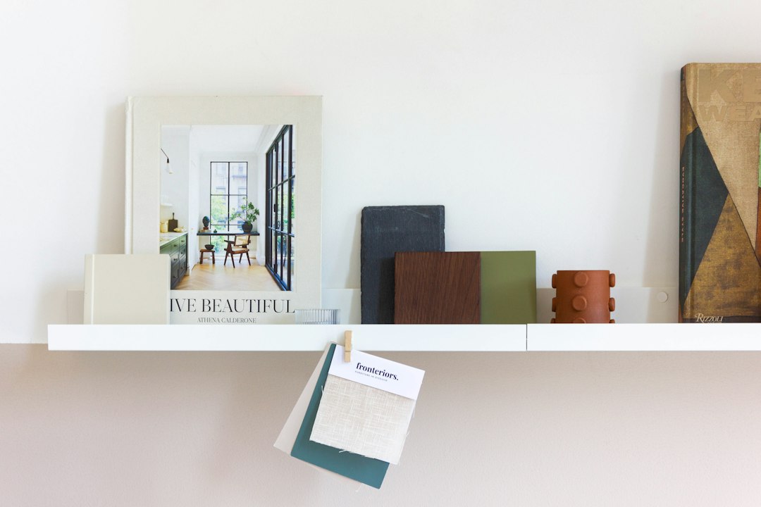
Glidden’s 2027 Color of the Year is a muted, warm neutral — the kind of color that reads differently depending on your light source, leaning slightly green in morning sun and grayer by lamplight. The brand’s pitch for it centers on “reset”: the idea that a single thoughtful color shift can change how a room feels without touching a cabinet, a countertop, or a floor. That’s a bold claim, but it’s one worth taking seriously rather than dismissing as marketing copy.
Color-of-the-year announcements tend to generate a predictable cycle of enthusiasm, counterarguments, and eventual indifference. But Glidden’s 2027 pick is landing at an interesting moment — material costs remain elevated, discretionary renovation budgets are being scrutinized hard, and a lot of homeowners are asking whether they can get meaningful results without committing to a full project. The short answer, at least for paint, is sometimes yes.
What “Reset” Actually Means on a Wall
The word “reset” is doing real work in Glidden’s messaging. The implied promise is that the right color can neutralize design decisions you’re tired of rather than requiring you to undo them physically. That’s partially true, but the mechanism matters.
Warm neutrals in the green-gray-beige family (often called “greige” with an earthy undertone) have a specific optical effect: they tend to make cool-toned or builder-standard finishes feel more deliberate. If you have white oak floors with slightly orange undertones, or light gray subway tile that feels sterile, a warm muted wall color can bridge that gap without replacement. The color absorbs visual conflict rather than amplifying it.
What it won’t do is transform a room with structural problems — poor proportions, low ceilings, inadequate natural light. Paint is a surface intervention. It works best when the bones of the space are already reasonable.
The Real Cost Equation
A full room repaint — walls only, standard ceiling height, no major prep issues — typically runs somewhere between a few hundred and several hundred dollars in materials, depending on square footage and whether you’re hiring out the labor. Verify current pricing locally, because paint costs have moved alongside broader material inflation. The Glidden line sits in the mid-tier price range; confirm current per-gallon costs at your nearest retailer before budgeting.
Compare that to the alternatives for getting a “reset” feeling:
- Cabinet refinishing: Generally $1,500–$5,000+ depending on kitchen size and condition (verify locally)
- New flooring: Highly variable, but rarely under $3–4 per square foot installed even for basic options
- Countertop replacement: Entry-level laminate starts around $1,000–$2,000 installed; stone can run multiples of that
Paint wins the cost-per-impact argument most of the time, especially when the goal is mood rather than function. That’s a genuine argument, not just a brand talking point. We’ve covered similar logic in articles about 4 paint colors that took a kitchen from blah to anything but boring and what happens when you commit to a dark color in a small kitchen — the results tend to surprise people who were expecting a half-measure.
Where This Color Profile Works (and Where It Struggles)
Not every room is a good candidate for a warm muted neutral. Here’s a quick breakdown:
Good fits:
- Bedrooms with east- or west-facing windows, where the color’s shift across the day feels intentional rather than inconsistent
- Living rooms with mixed furniture finishes — warm neutrals are unusually forgiving of eclectic collections
- Home offices where you want a calm backdrop without the clinical feel of a cool gray
Harder cases:
- North-facing rooms with limited natural light — warm neutrals can read muddy rather than grounded; test a large swatch (at least 12” × 12”) and observe it at multiple times of day before committing
- Rooms with heavy cool-toned fixed elements (charcoal tile, cool white trim) — the undertone clash can make both surfaces look off rather than complementary
- Very small rooms already painted a lighter color — the warm muted tone may darken the perceived space more than expected
The swatch test is non-negotiable. Paint a section large enough to read from across the room, let it dry fully (wet paint reads darker and more saturated than dry), and check it in morning light, afternoon light, and under your artificial lighting before buying full quantities.
Pairing It With What You Already Have
The reset framing implies working with your existing finishes, not against them. A few specific pairing approaches worth considering:
If your trim is bright white, the contrast will be higher than you might want with a warm neutral wall — consider whether a soft off-white or cream trim would serve better, or whether a slight sheen difference (eggshell walls, satin trim) can soften the boundary enough without repainting everything.
For rooms where the ceiling is already a standard flat white, leaving it alone is usually fine — the warm wall will recede slightly and the white ceiling will read as brighter by comparison, which often reads as added height. 7 ways to refresh a home without a full remodel covers this ceiling-wall contrast principle alongside other low-cost interventions worth stacking with a repaint.
Furniture with wood tones in the medium-to-warm range (walnut, oak, cherry) tends to anchor well against this color family. Furniture in cool gray or bright white can create a tension that reads as intentional in some contexts and unresolved in others — look at reference images with similar combinations before deciding.
Before You Buy the First Gallon
One practical step that often gets skipped: photograph the room in its current state, then use a paint visualization tool (most major paint brands offer one; a few independent apps let you upload your own photo) to preview the color before purchasing. The preview won’t be photorealistic, but it will tell you whether the direction is right. If the preview looks wrong in two or three attempts, that’s a signal to pull a few more swatches from a different color family rather than forcing this particular one.
Also check the LRV — Light Reflectance Value — of any color you’re seriously considering. Glidden lists LRV on its product pages (as of our last check). A warm muted neutral in this category typically lands somewhere in the 40–60 LRV range, meaning it reflects roughly 40 to 60 percent of available light. Rooms with limited windows can still handle colors in this range, but you’ll want to account for the shift by ensuring your lighting is adequate — something as simple as adding a well-placed lamp can make the difference between “sophisticated and calm” and “dim and flat.” Our roundup on clip-on lights covers some low-commitment options if you want to test a lighting adjustment before committing to new fixtures.
The actual next step: before ordering anything, pull at least three paint chips in the warm neutral family — including Glidden’s 2027 pick and two adjacent shades, one warmer and one cooler — tape them to the wall you’re planning to paint, and photograph them at the same time of day for three consecutive days. If the Glidden pick still reads best on day three, that’s as close to a confident decision as a paint chip allows.