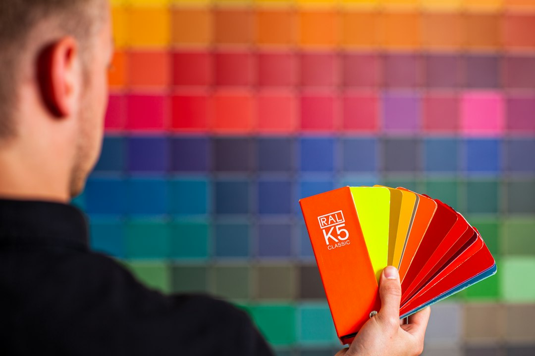
Cabinet paint color is one of those decisions that looks simple until you’re standing in a hardware store holding seventeen white swatches under fluorescent light, all of which look identical, none of which will look the same in your actual kitchen. The color choice matters, but the framework for making it matters more: what’s the architectural style of the space, what does the light source do to undertones, and what’s the finish on the hardware and countertop you’re keeping?
We’ve organized this by design style because that’s the most reliable starting point — and because “popular right now” is the least useful filter for a decision you’ll live with for the next decade. As we’ve noted before when covering kitchen updates that don’t hold their value, trendy color choices can age a kitchen faster than almost any other single variable.
Traditional and Classic American Kitchens
Raised-panel cabinet doors, crown molding at the top of the run, furniture-style feet on the island — these details belong to a specific visual language, and the color needs to speak it fluently.
Warm whites and off-whites are the most defensible choice here, but “white” is doing a lot of heavy lifting in that sentence. A bright, blue-toned white reads as contemporary or institutional in a traditionally detailed kitchen. What works is a white with a cream, linen, or greige lean — think of the spectrum that runs from barely-there ivory to something closer to a true antique white. In paint terms, you’re looking for warm undertones: yellow, red, or orange-adjacent, not green or blue.
Soft sage and muted olive greens also read as traditional when the rest of the kitchen has classic detailing. These work particularly well when countertops are a warm stone — cream limestone, beige-veined marble — and hardware is unlacquered brass or oil-rubbed bronze.
Navy and deep hunter green are the more committed traditional options. They work on base cabinets paired with white uppers, especially in kitchens with good natural light and tall ceilings that can absorb the visual weight. In a lower-ceilinged galley, the same navy that looks stately in one room will feel like a bunker in another.
Farmhouse and Modern Farmhouse
The modern farmhouse style has been in circulation long enough that some of its signature moves are starting to read as dated — but the core palette is still sound when applied with restraint. We’d steer you toward a middle path between the all-white shiplap aesthetic (which peaked and then kept going) and the overly rustic barnwood-everything direction.
Chalky, slightly gray whites are the workhorse here. The classic Benjamin Moore Chantilly Lace comparison point is useful: it’s bright without being blue-cold. A warmer alternative sits in the Swiss Coffee or White Dove territory — creamy without veering into yellow.
Warm grays and greiges have more staying power than they get credit for in this style. A warm greige on cabinets with open floating shelves in wood, a farmhouse sink, and matte black hardware is a combination that’s been working since before the farmhouse trend crested, and it will keep working after.
Two-toned palettes — white uppers, darker lower cabinets — originated in farmhouse and cottage kitchens. If you go this route, keep the contrast ratio reasonable. A white upper paired with a medium-toned muted green or grayish-blue lower is legible; white uppers paired with near-black lowers in a tight space gets heavy fast.
One practical note: farmhouse kitchens often have rougher, more textured cabinet surfaces than contemporary flat-front cabinets. A semi-gloss finish on heavily profiled raised-panel doors can look plasticky. A satin finish at 25–35 sheen typically gives you enough durability for a high-use surface without the visual harshness.
Contemporary and Minimalist
Flat-front, slab-door cabinets in contemporary kitchens are less forgiving of color inconsistency because there’s no shadow relief from profiling to distract the eye. Every brush mark, roller stipple, or uneven application is visible. This makes finish quality as important as color selection — and it’s the most common place DIY cabinet repaints go wrong on minimalist cabinets.
Matte to eggshell whites with neutral to cool undertones do the most work in contemporary spaces. The goal is a surface that reads clean without competing with the texture of a concrete countertop, the grain of a wood island, or the reflective surface of stainless appliances.
Warm charcoals and soft blacks are the other contemporary standard. On a flat-front door, a deep charcoal with a slight warm undertone (not blue-black) pairs well with brass or gold hardware and creates enough contrast to define the kitchen without requiring much else.
Color-saturated contemporary cabinets — terracotta, deep dusty blue, muted burgundy — are increasingly common in European-influenced minimalist kitchens and are starting to appear more widely in US renovations. These work well when a single run of cabinets is the visual anchor and everything else (counters, backsplash, walls) is held neutral. You can see what strategic color commitment does in a single space in this kitchen transformation using four paint colors — the lesson translates directly to cabinets.
Midcentury Modern
Midcentury kitchen cabinets were often wood-forward — teak, walnut, and birch veneers — or occasionally painted in warm, earthy, muted colors pulled from the period palette. If your kitchen has MCM bones (low horizontal lines, minimal hardware, possibly some original laminate surfaces), the paint options that work are more constrained than in other styles, and that constraint is useful.
Avocado and harvest gold remain polarizing. Used in small doses — say, a lower cabinet run in a muted, desaturated version of that green — they’re period-accurate and can be genuinely appealing. Used everywhere, they require significant commitment.
Warm taupes and tans serve MCM kitchens well when paired with exposed wood shelving or a butcher block countertop section. Think of the warm side of a greige — not gray-leading, but not obviously beige either.
Terracotta-adjacent tones — dusty salmon, muted rust, warm clay — also have period precedent and work in kitchens with tile or terrazzo floors in analogous warm tones.
One calibration issue specific to midcentury spaces: original 1950s–1960s kitchens often have smaller windows than contemporary builds, which changes how undertones behave. Pull your paint sample in the actual space and check it in both morning and artificial evening light before committing. This is especially true with any warm-toned color, where incandescent light will push orange and red undertones hard. For additional context on navigating tricky paint whites and near-neutrals in kitchens with mixed lighting, our guide on choosing white paint for your space covers the undertone evaluation process in detail.
Transitional Kitchens
Most American kitchens built in the last twenty years are neither fully traditional nor fully contemporary — they’re somewhere in between, with Shaker-style doors (a raised panel simplified to a flat recessed center), modest crown molding or none, and hardware that leans one direction or the other. This is the transitional kitchen, and it’s the most flexible category for color.
That flexibility is also the trap: with no strong architectural commitment, there’s no natural anchor for the color choice. Here’s a short checklist for transitional kitchens to narrow the field:
- Identify your fixed elements first. What’s staying? Countertop, flooring, and hardware color all constrain the palette. If you have warm-toned granite and the budget to replace hardware but not the counter, your cabinet color needs to work with that stone.
- Determine your light quality. North-facing kitchen with little direct sun? Cool-undertoned grays and blues read accurate. South or west-facing with strong afternoon light? Warm whites and greiges will stay warm without crossing into yellow.
- Decide on the contrast level you want between upper and lower cabinets, or between cabinets and walls. Transitional kitchens handle two-tone palettes well.
- Check the sheen category against your cabinet door profile. Shaker doors tolerate satin better than matte (hard to clean) or semi-gloss (can look cheap on wood detail). Flat-slab contemporary doors can handle a slightly higher sheen.
- Buy samples in the actual paint formula you’ll use, not a chip. Paint chips are printed ink, not the paint itself, and they lie about undertones at scale.
Your most actionable next step before you order a gallon of anything: tape a 12-by-12-inch painted sample board to an actual cabinet door — not the wall, not a separate card propped against the cabinet — and photograph it in the afternoon light you can’t control. The color you see in that photo, in that light, in that kitchen, is the decision you’re actually making.